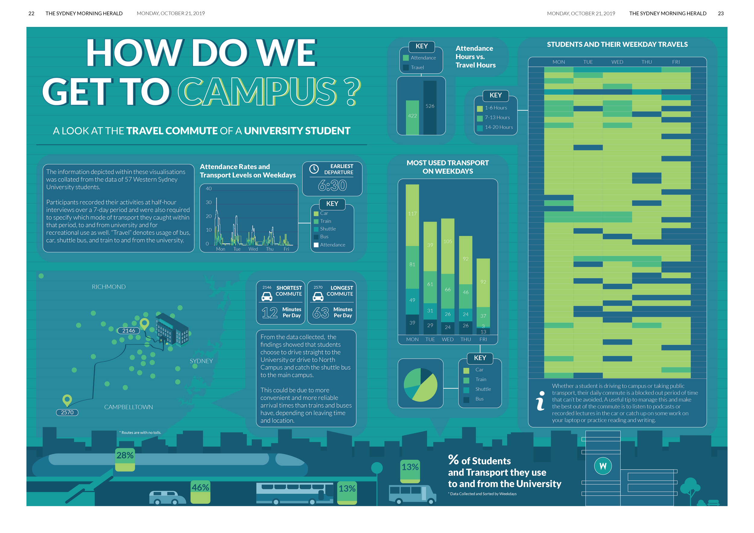
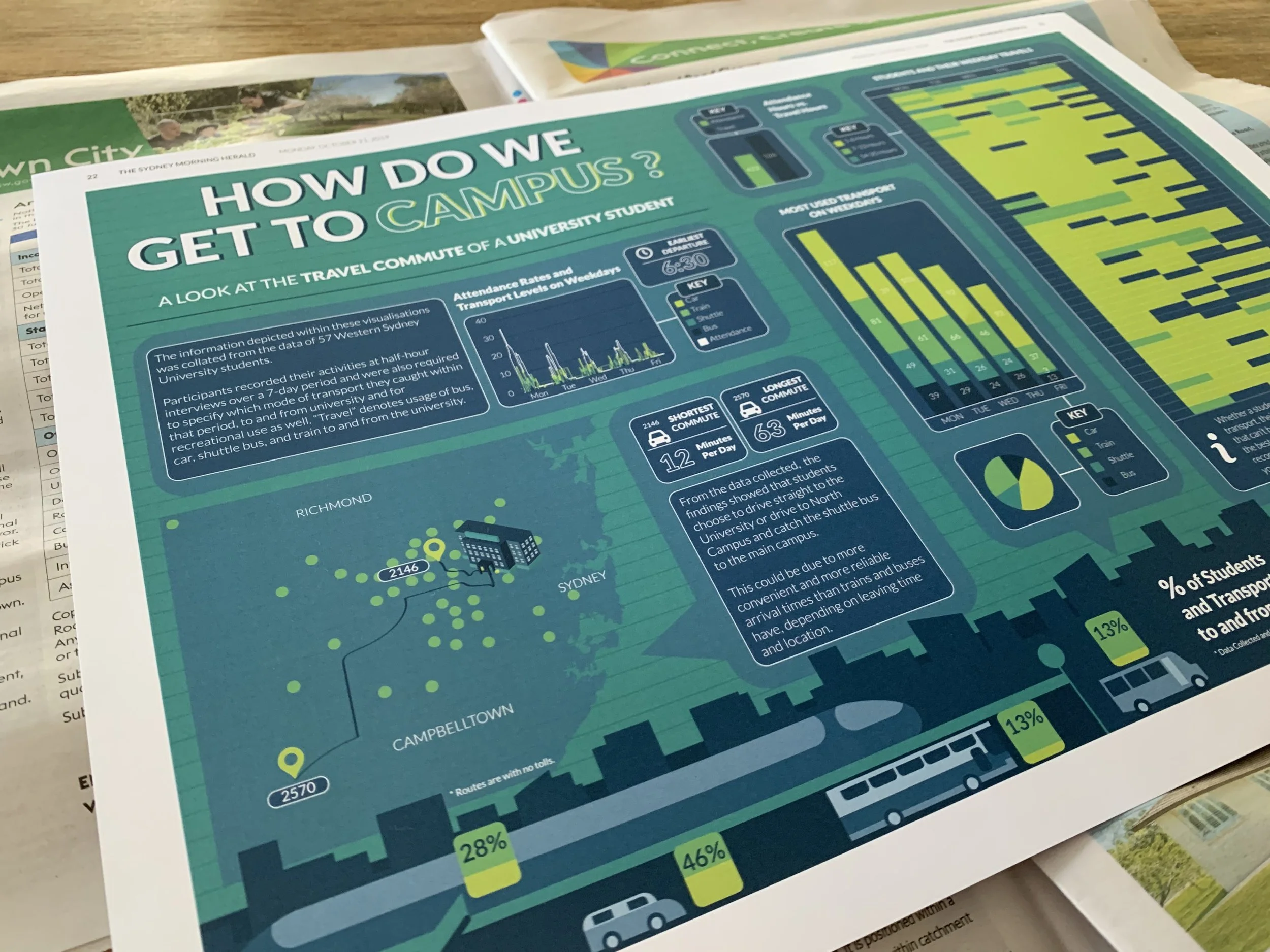
DATA VISUALISATION - The travel commute of a university student
I created a clear, data-driven visualisation created using Excel for data preparation and Tableau for analysis and design, before illustrating in Illustrator, which reveals how university students’ commuting time and transport choices shape their daily routines, highlighting the hidden time cost of travel and its impact on attendance and weekday behaviour.